Illustration by Will Cushman; image via UW Applied Population Lab

A graph showing the number of men and women by age group might sound like something Ferris Bueller's teacher would have used to lull his students to sleep, but in fact it's among the most important data visualization tools for forecasting social and economic change.
Called a population pyramid, it is a specialized form of a bar chart that captures lots of important information about the ages of people who live in a particular place at a particular time. The size of each age group is important because people tend to have major life transitions at certain ages — from starting kindergarten around age 5 to retirement around age 65. Comparing population pyramids over time can explain a lot about what life is like in a place, as well as its economic and social challenges. These visualizations can even reveal information about the past experiences and the future prospects of a population.
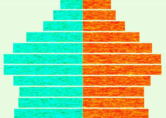
To read a population pyramid, it's important to first understand that it's really just two bar charts, turned on their sides. In this example, the left side shows the number of males, and the right side shows females.
Each of the individual bars shows the number of people in an age group. Their ages are shown in a shared label in the middle. Here, people ages 55-59 have been highlighted under point 1.
The length of the bar shows the relative size of that age group in the population as a whole. Point 2 highlights that males aged 15-19 make up about 3.5% of the total population. The axis is the same for the male and female sides of the population, as described in point 3.
This population pyramid is for Wisconsin in 2010, and it has a unique silhouette. Its hourglass shape is characteristic of portions of the United States and Europe over the past few decades, where there was a major "boom" in the birth rate following World War II. The bulge around ages 45 through 64 represents the generation known as the baby boom.
A population pyramid that's actually shaped like a pyramid depicts a growing population, where there are many more children than adults.
For example, the 2017 population pyramid for the nation of Burkina Faso is strongly skewed toward children. From this, scientists can predict that the total population of the country is growing rapidly and will continue to grow for a while. In addition, the number of children each woman births is high, suggesting that few women work outside the home and likely have low educational attainment.
Mortality rates are fairly high and life expectancy is low, as shown by the strongly shaped taper as the age categories go up. These facts help demographers forecast the future of Burkina Faso's social and economic needs — as its population of young people grows, the nation will require more housing, more schools and ultimately see a growing economy as the relatively large number of younger people become adults and enter the workforce
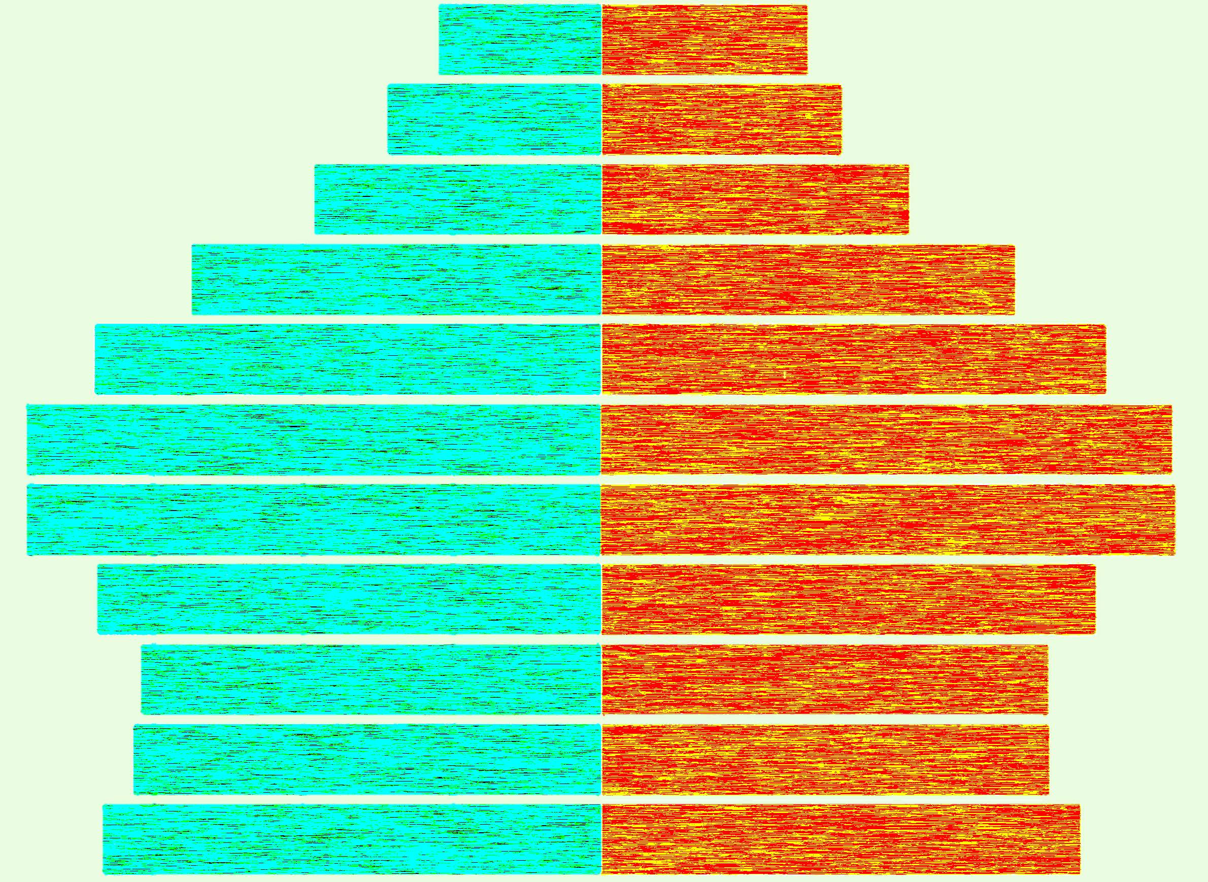
However, not all population pyramids show this structure. For example, the 2017 population pyramid for Italy is reversed. This nation has some of the lowest birth rates in the world, which is reflected in a graph that has a very narrow base and wider bars in middle- and older-age categories.
Italy struggles with social change due to the deficit of young people in its population, and can expect this struggle to continue as its largest population subgroups reach retirement ages — with fewer young people contributing to the economy in the future. Overall, Italy's total population is shrinking.
A third major population pyramid type is described as stable. The 2017 population pyramid for the United States has the silhouette of a pillar or column. The even distribution of people across different age groups suggests a population that is neither growing nor shrinking rapidly. In fact, the U.S. population is growing, but quite slowly. The number of births per woman is just above replacement levels.
There are other types of patterns that are illustrated by population pyramids.
Typically, populations are more or less balanced across men and women at each age. Women generally have lower mortality at every age and live longer than men, so at the oldest ages the difference in mortality by sex accumulates and shows up as wider bars on the female side of a population pyramid.
However, in rare cases major social upheaval — such as war or massive migration — will skew a population pyramid's sex balance dramatically. For example, the 2017 population pyramid for the United Arab Emirates has a strongly uneven distribution of men and women in its population due to the number of males who migrate to that nation for work.
Looking at the 1950 population pyramid for what is now the Russian Federation, it's possible to see the effects of World War II in the shorter than expected bars for men aged 20-50, as well as smaller number of children ages 5-9.
A variety of broad population processes show up as dimples and bulges in population pyramids. Each individual pyramid only shows a snapshot of the population at a given time, yet it can be used to infer historical events that may have shaped the population as well as future social forces that will come into play as each cohort ages.
Population pyramids are widely used as descriptive data analysis tools. They can be made for nations, states, counties or even cities, separately for different racial categories or educational attainment classes, and compared across time. They are very useful for highlighting the number of people who are in the important life transitions — birth, starting school, going to college and/or entering the workforce, marriage, deciding where to live, having children, retirement, old age and, ultimately, death.
Population pyramids can even reveal how many people are going to be in these life transitions in 5, 10 or 15 years. Because so many social forces are tied to such moments, they are powerful tools.
Editor's note: This item was updated to clarify the age range of the baby-boom generation.